

Hi, I’m Patrick
I specialize in thoughtful brand identity and simple, clever illustrations.


People Via Plants
Logo, Brand Identity, Illustration, Custom Logotype, Gifs
People Via Plants is a collaboration between Matt & Val that seeks to explore and reinforce the connection between people and plants via handmade ceramics. They use ceramic’s inherent repetition of form as an opportunity to experiment with color combinations, glazes, and textures so every piece they create is unique. I created a brand identity with a custom logotype, typography system, bright colors, and illustrations to reflect their fun, carefree exploration of ceramics and reinforce the connection between people and the plants around us.


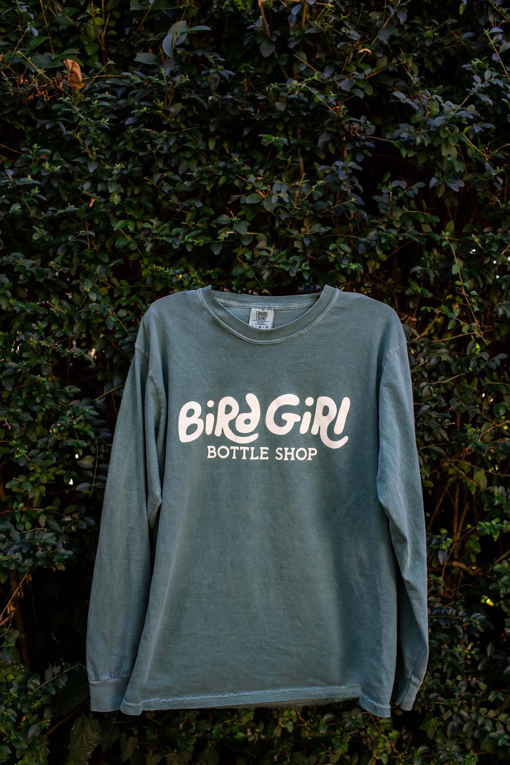

Bird Girl Bottle Shop
Logo, Brand Identity, Illustration, Custom Logotype
Bird Girl Bottle Shop is a…well, it’s a bottle shop, obviously. But it’s also the vision of a couple that moved to Newport News, VA with the goal of creating a space for their new community to come together, hang out, and enjoy themselves in a space that feels more like hanging out at your best friend’s house than going to a stuffy, upscale bottle shop. I did my best to capture their brand’s approachable identity with an illustrated logo, hand drawn logotype, type system, and color palette.


WORN
Art Direction, Email Design, Digital Ads, Social Media, Website Layout
WORN makes socks. More specifically, they make all kinds of socks (for workouts, everyday, winter, hiking, and more) using their own blend of Arrowool™. Don’t even get them started on why it’s better than cotton unless you’re really interested in learning all about the differences between cotton and wool. I worked with them to expand on their existing branding to pivot to a more approachable, simple, yet still product-focused look for their emails, ads, and social media. We expanded their color palette and took a fresh look at the type of photography they use.


Veld
Art Direction, Illustration, Lettering, Apparel Design
Based in Amsterdam and with ties to California, Veld is an apparel company that aims to merge elegant Dutch design with that classic California laid back vibe. They trusted me with creating artwork for their first two clothing collections.

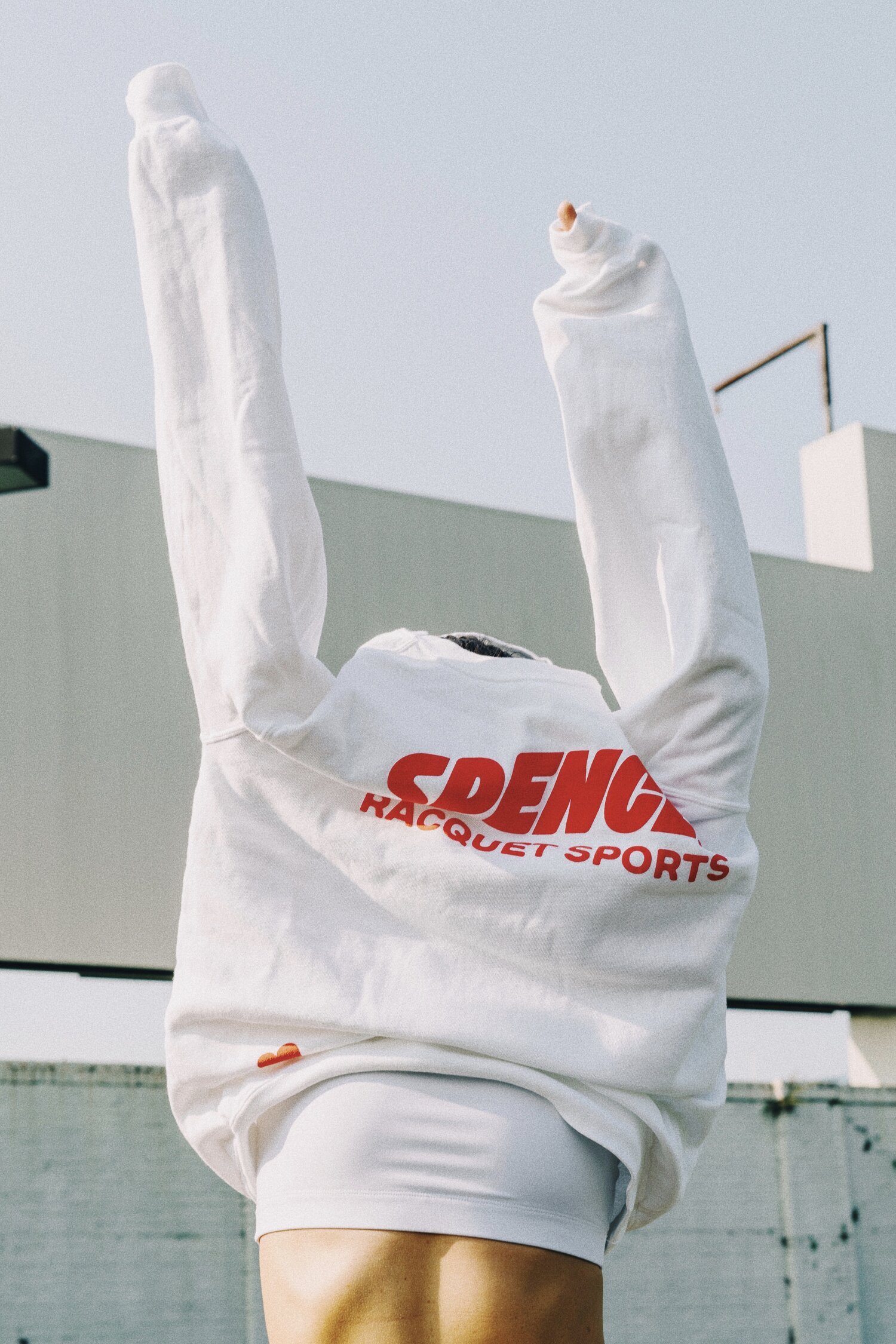


Spence
Logo, Brand Identity, Illustration, Lettering, Apparel Design
With a love of classic design, but a focus on the future, Spence is a racquet sports brand whose goal is to bring tennis out of the country club and into the public. I worked closely with them to design their visual identity from scratch - a custom logotype, icons, brand color palette, and a few graphics for their first line of products.


Forever Magazine
Magazine Layout, Art Direction, Prepping Files for Print
Forever is an independent art & literature focused magazine. I joined the Forever team to help them get all 148 pages of their fourth issue to print (which was featured in It’s Nice That). I worked with their Creative Director on the art direction for their Lost & Found theme, page layout, and prepping the final magazine file for the printer.


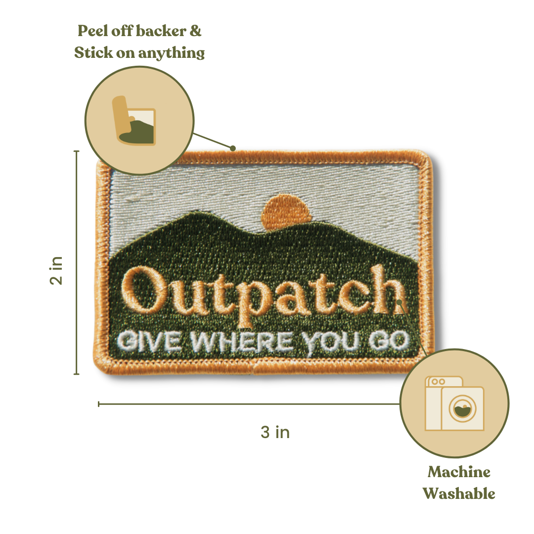

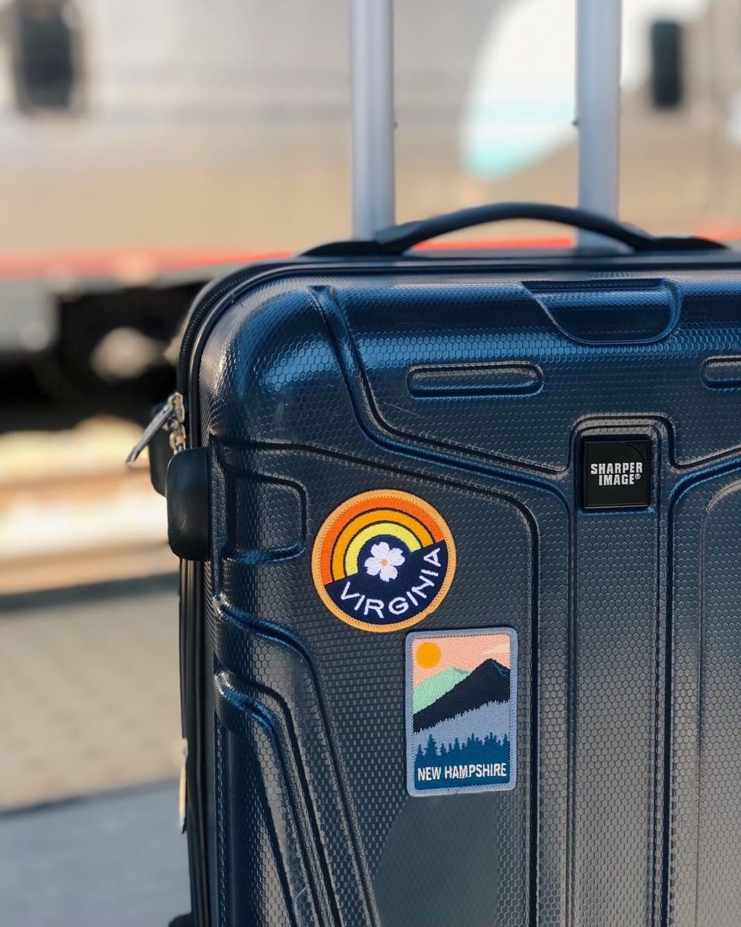

Outpatch
Logo, Brand Identity, Illustration, Lettering, Iconography, Patch Designs
Outpatch had a vision to create custom patches for people to commemorate various trips while also giving back to those communities, but they needed help with the vision for their company’s visual identity. They trusted me to help build their brand from the ground up - logos, type system, brand colors, their tagline, patch designs, and more.


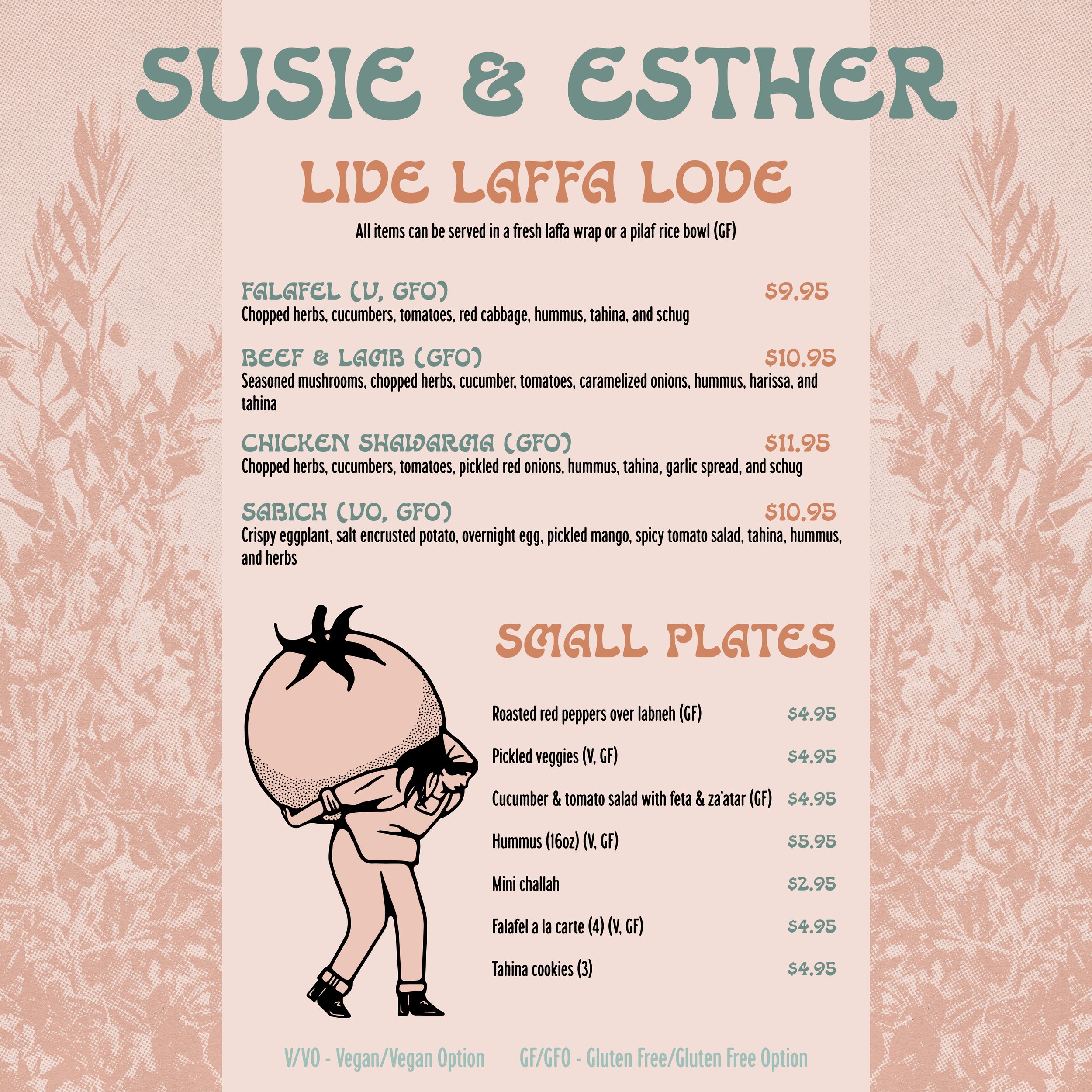


Susie & Esther
Logo, Brand Identity, Illustration, Menu Templates
Susie & Esther, named after the founder’s grandmothers, is a Mediterranean and Jewish American food catering service located in Richmond, Virginia. They pride themselves on making nearly everything from scratch, sourcing the freshest ingredients, and using traditional recipes. My goal was to create a brand identity for them to reflect their strong work ethic, fresh ingredients, and traditional Mediterranean and Jewish source of inspiration.


Cheat Sheet Design
Logo, Brand Identity, Illustration
Cheat Sheet Design, an online interior decorating business, approached me looking for a brand identity that was minimal and modern, but stood out from other similar brands. I added a touch of art deco to help their identity stand out and reflect their interest in vintage design elements.


Tisk/Task
Logo, Brand Identity, Illustration, Iconography
TiskTask is a creative, problem-solving platform with the goal of empowering kids to be effective change-makers. The interactive web-based application uses real-world problems to develop empathy, critical thinking, and communication skills. After being given a problem (TISK), the students will be assigned a series of TASKS to create a measurable solution to the problem. I worked in collaboration with Rob Wooten to create a brand identity system for TiskTask, including a primary and secondary logotype, a style guide, a set of icons, and several patterns, among other brand collateral. We wanted to create a visual identity that evokes a sense of excitement, youthful energy, curiosity, and problem solving.


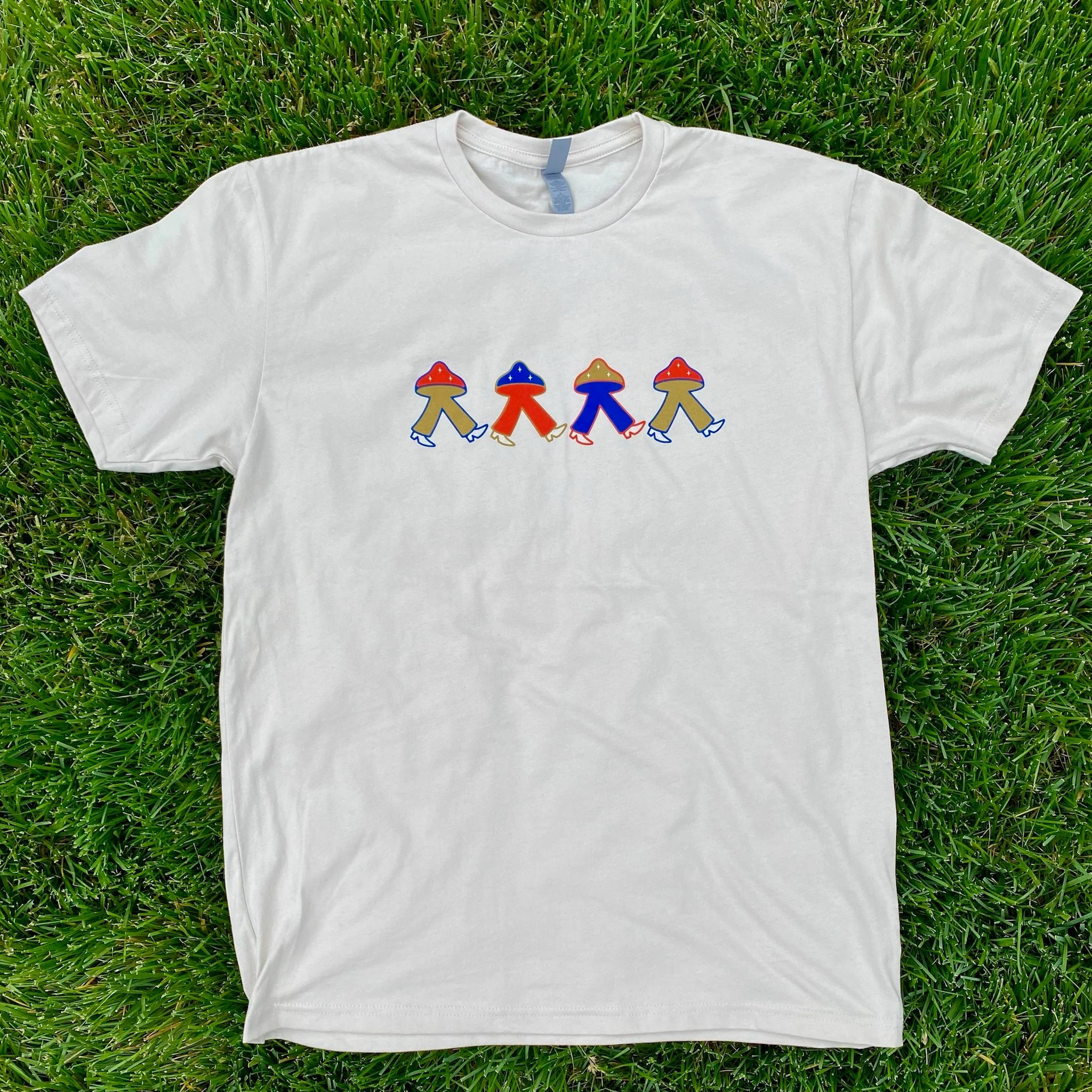

American Shroomer
Logo, Brand Identity, Illustration
The good folks behind American Shroomer wanted their branding to reflect their name, but the challenge was to not be too American/patriotic and to make a mushroom that feels ownable, recognizable, and not generic. The solution was a trio of magical little stars and a toned-down retro color palette to lean into that counter culture vibe.